Scientific Graphing. We often describe of a graph as a plot of A versus B. This means that A is plotted on the y axis and that B is plotted on the x axis. Generally the quantity plotted on the y axis is also the dependent variable and that on the x axis is the independent variable—that the value of A is dependent on B. Thus in the experiment we would vary B and then measure A as a function of B.
The following example is a graph of count rate versus time.
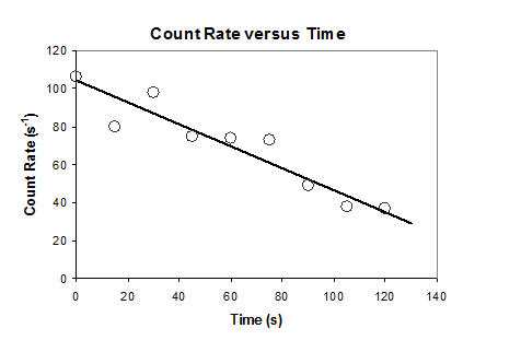 |
A graph has a main title which describes what it is a graph of. In this example it is a graph of “Count Rate Versus Time”. Each axis also has a title which describes what is plotted on that axis AND the units of the quantities on the labels. In this example the y axis is “Count Rate” in units of “s−1”. The x axis is “Time” in units of “s”. Tick marks on the axes show uniform intervals. The tick marks are labeled with the values. The data points are plotted on the graph as symbols. In this example the data points are represented by open circles. The value corresponding to the data is in the center of the symbol. The line that best fits the experimental data is also plotted on the same graph with the symbols so that the correlation and scatter of the experimental data point can be easily seen.
Each graph must have the following components:
- The correct quantities plotted and on the correct axes.
- A main title.
- Both axes must have titles with w/ units.
- Both axes must have tick marks and labels.
- The data are plotted as symbols.
- The best fit line obtained by linear regression is plotted as a line.
Graphs that to not fulfill these basic requirements will not be accepted.
